The engagement
PSYCHOTHERAPY / PHILADELPHIA
What we did
- Website design
- Information architecture
- Responsive website delivery
A welcoming introduction. A clearer way to begin.
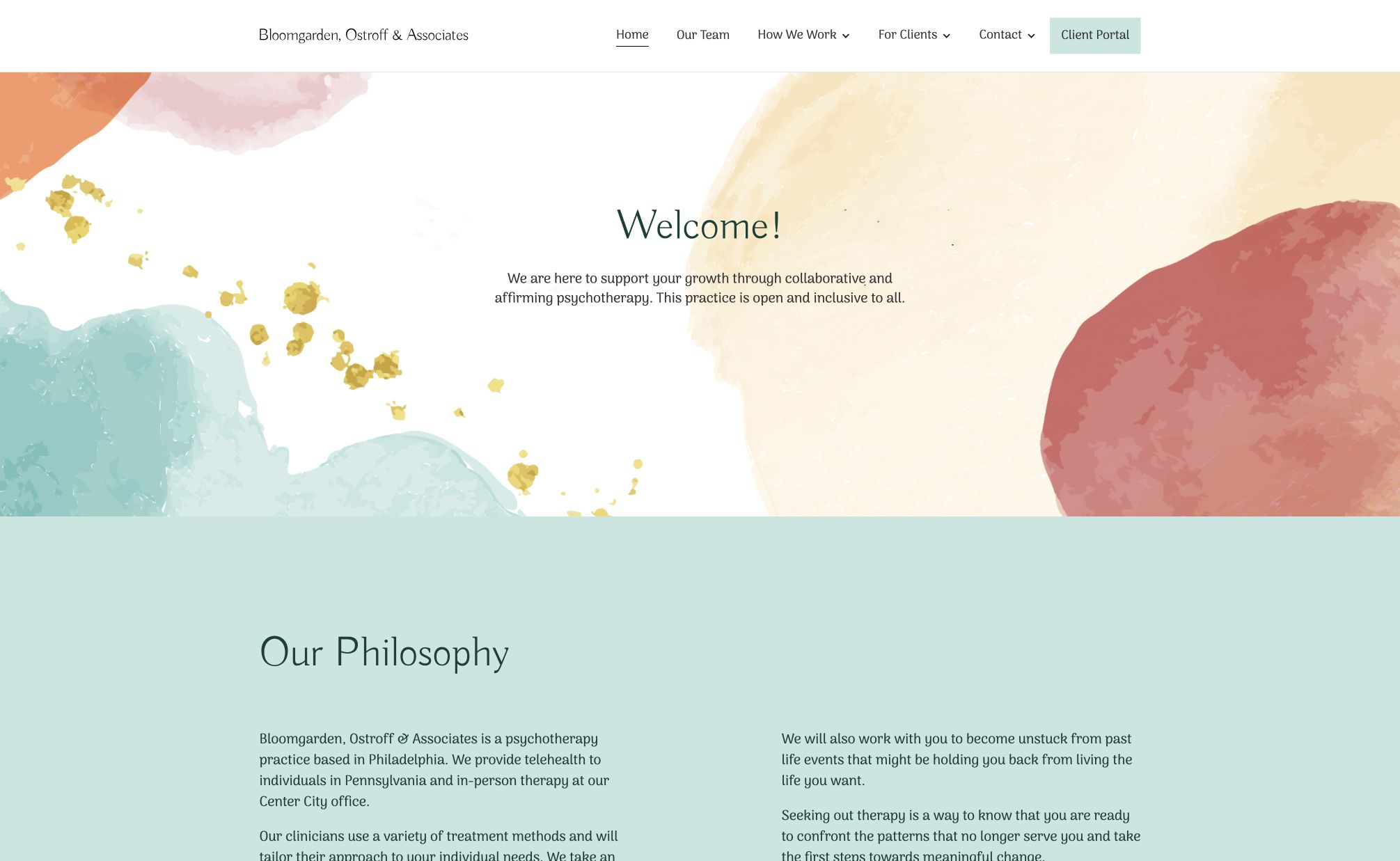
Bloomgarden, Ostroff & Associates brings different clinicians, approaches and services together. The website needed to reflect the character of the practice while helping prospective clients understand their options. We paired a calm visual approach with a clear structure for the team, therapeutic values and practical first steps.
Delivered by Supersites, now Superfactor.
01 / THE NEED
Help people find the information behind the decision.
Choosing a therapist is a personal decision, often made before someone feels ready to begin a conversation. Visitors may want to understand the people, approaches, costs and practicalities before reaching out.
We organized the website around that decision: a welcoming introduction to the practice, space to explore its clinicians and clear routes to the information behind getting started.
02 / THE EXPERIENCE
Let the practice’s character come through.
Soft watercolour shapes, organic forms and a restrained palette give the website a welcoming tone. Spacious layouts and expressive serif typography keep the presentation calm rather than clinical.
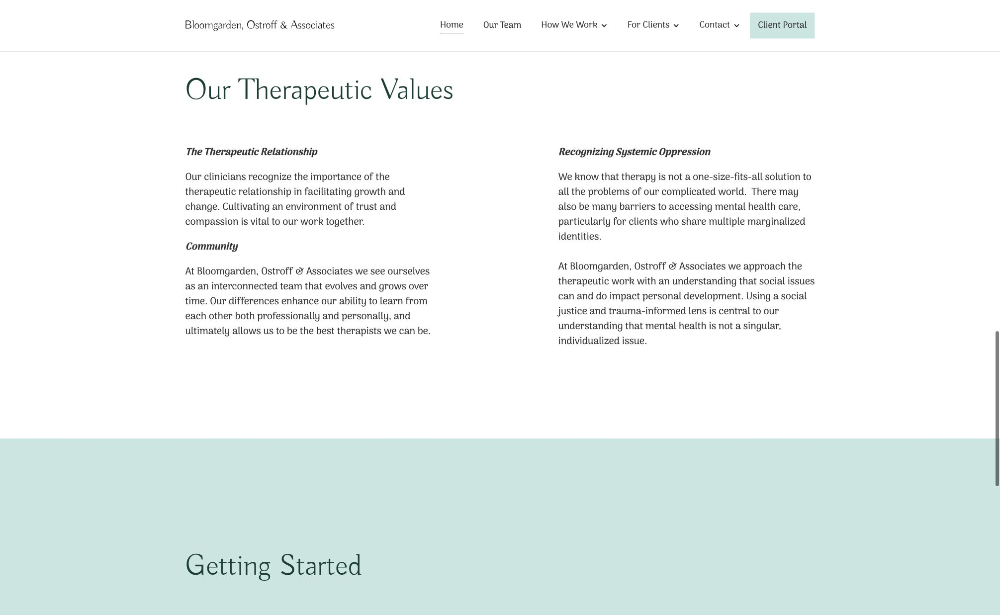
The practice’s philosophy and therapeutic values have room to be understood. The design invites exploration without asking someone to make an immediate enquiry.
03 / THE PEOPLE
Make the people behind the practice easier to know.
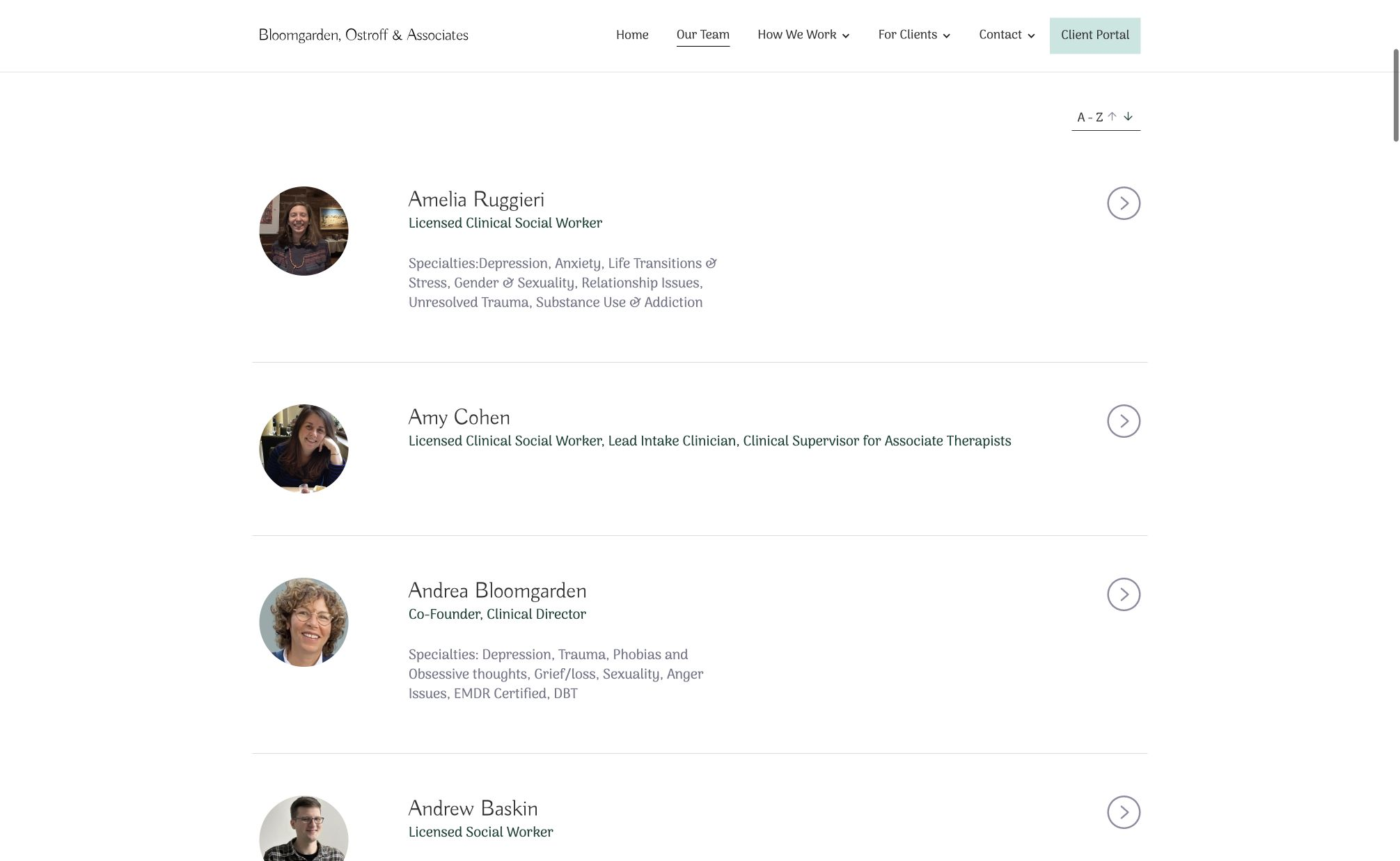
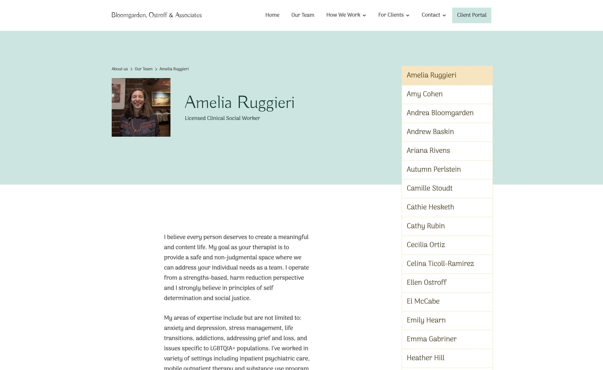
The team directory brings clinicians’ names, roles and areas of focus into a consistent view. Individual profiles give each person space to explain their approach, with the wider team still within reach.
Visitors can move from an overview to a more personal introduction as they consider whom they might like to speak with.
04 / PRACTICAL INFORMATION
Connect reassurance with practical answers.
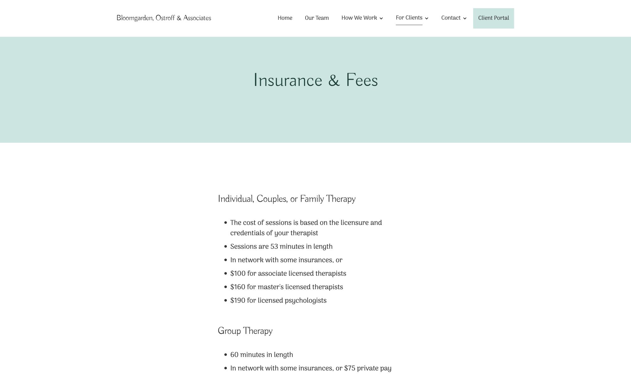
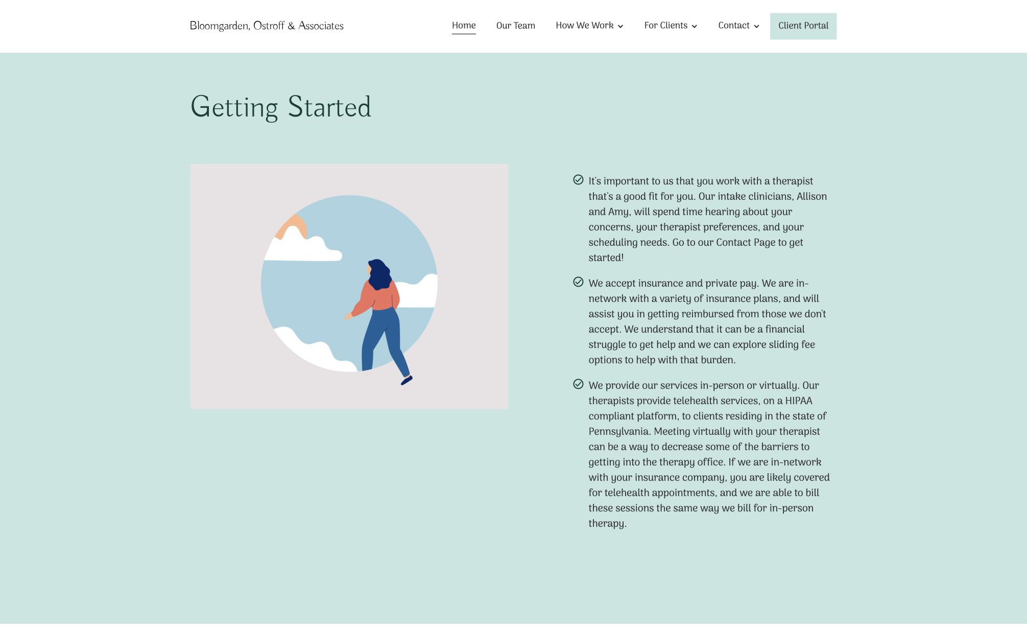
A welcoming introduction is only part of the task. Insurance and fees, treatment information, frequently asked questions and the intake process each have a clear place in the structure.
The Getting Started section connects those practical details with the next step. Visitors can explore what matters to them without working through one long, undifferentiated page.
05 / THE FIRST CONVERSATION
Keep the next step clear, without rushing it.
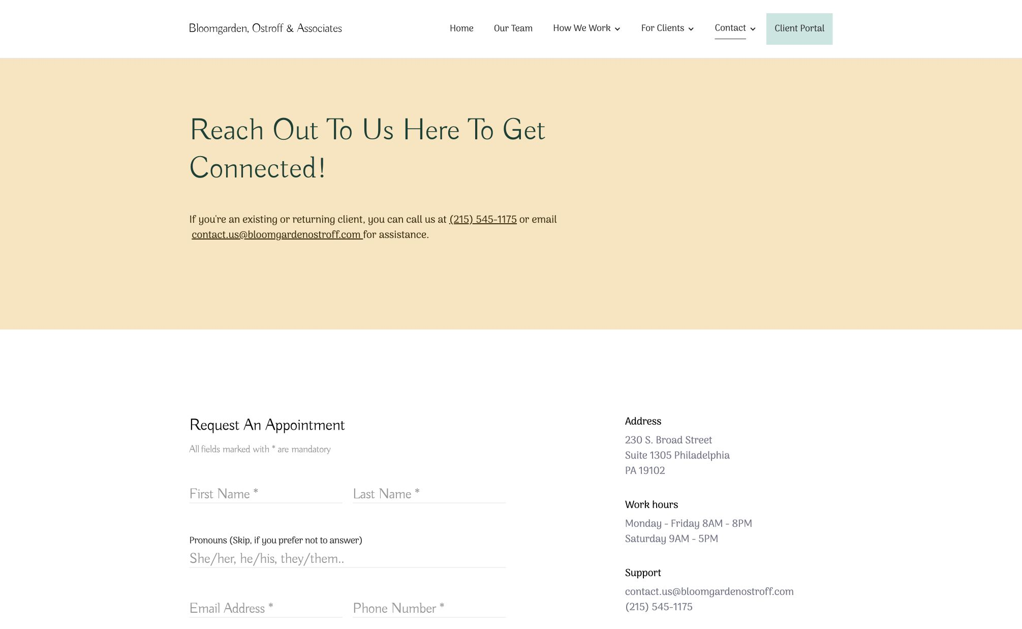
A dedicated contact route brings the appointment request and practice contact information together. Appointment format, scheduling and therapist preferences are part of the intake conversation rather than hidden behind a general email link.
The website supports different stages of readiness: learn about the practice, meet its people, explore practical questions and reach out when ready.
The outcome
What changed
A website organized around getting started.
The website presents the practice’s people and approach alongside the practical information prospective clients need. Its contribution is a clearer, more considered introduction to care, with room to explore before beginning a conversation.
The people
A place to explore the clinicians behind the practice and understand their individual approaches.
The practical questions
Clear routes into treatment information, fees, insurance and the intake process.
The first conversation
Visible contact information and an appointment route connect exploration with getting started.
CLIENT PERSPECTIVE · DRAFT
“They understood the care behind our practice and made our expertise clearer, helping the first step toward support feel more approachable.”

Andrea Bloomgarden
Co-Founder & Clinical Director
MAKE YOUR
NEXT MOVE.
We help businesses build stronger brands, adopt AI, modernize systems, and create better digital experiences.
Wish to see how we can help?
Selected work.
View all work
Superfactor
A new identity and website for the agency we’ve become.

SkinSpirit
One digital front door for local markets nationwide.

Edwards Printing
From order intake to production—one connected workflow.

Webex Ahead.
A platform for what comes next.

Prag
A clearer digital presence for four decades of railway engineering.
01 / 05
Explore our workSwipe to explore