The engagement
Self-initiated / Brand & website
What we did
- Brand identity and expression
- Website strategy and content
- UX and responsive design
- Editorial imagery
- Motion and interaction design
- Human and AI agent presentation
A wider role. A clearer introduction.
Supersites made an introduction easy. It also created an expectation. As our work extended beyond websites into brands, products, business systems and AI adoption, the new Superfactor identity had to make that wider role visible.
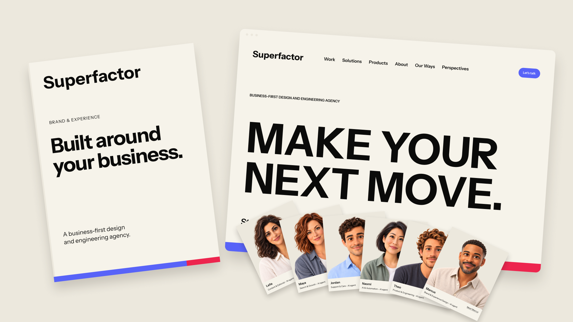
We are a business-first design and engineering agency. The brand and website show the work, explain the engagement and introduce the people and AI agents behind it.
Self-initiated brand and website project.
THE BRIEF
Widen the introduction without making it vague.
A visitor should recognize an agency, understand the business problems it can help address and see evidence of the work. The identity needed enough authority for a serious business conversation and enough character to invite one.
01 / THE IDENTITY
A recognizable sign for a broader business.
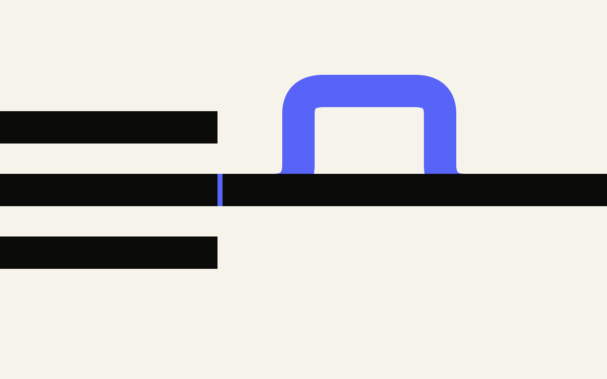
The FactorMark gives Superfactor a recognizable presence even when the full name is not in view. An open square frame meets a solid circle: business structure and the people it serves, brought into the same mark.
The two forms remain distinct. Their overlap expresses the connection we work to improve between a business, its systems and the people using them. Beside the wordmark, the symbol shares one colour so the identity reads as a single signature.

 Superfactor
02 / COLOUR WITH PURPOSE
A palette with a personal history.
Our founder, Prateek Chandra, came to the United States in 2012 and built this business from the ground up. The palette carries his gratitude for the country that made that journey possible and his belief in its capacity for progress.
Sapphire and Watermelon reinterpret American blue and red with a lighter, more optimistic character. Paper and Ink ground that energy in warm neutrals and restrained contrast.
The FactorBar gives the palette a distinctive proportion: 80% Sapphire and 20% Watermelon. The mark identifies the company; the bar gives its communications impact. It is never monochrome.
03 / TYPOGRAPHY
One voice from headline to detail.
Instrument Sans gives the website a consistent voice at very different scales. Large, tightly composed statements establish the subject. Short introductions, clear labels and readable supporting paragraphs do the quieter work of explanation.
Our slogan is “Make your next move.” It gives the brand a direct invitation. The supporting hierarchy connects that invitation to the concrete business priorities the agency can help address.
MAKE YOURNEXT MOVE.
04 / THE ARRIVAL & REVEAL
The identity becomes the entrance.
Before the website explains what Superfactor does, it gives the identity room to be experienced. An embossed wordmark sits within a Sapphire field. A sweep of light gives it a sense of material, then Watermelon enters from the edge to establish the FactorBar at the scale of the screen.
The first scroll turns the opening into a reveal. The coloured field moves away to uncover an Ink stage, the navigation and the slogan. As the composition settles, the FactorBar remains as a strip at the base of the hero.
Colour, proportion and typography behave together. The visitor controls the reveal through ordinary scrolling and can move straight into the content.



05 / READING IN MOTION
Give the important words a moment.
The website changes pace after the opening. Large editorial statements introduce a business perspective, with Sapphire drawing attention to the words that matter. Supporting copy moves from muted text through colour into a fully readable state as the visitor scrolls.
The effect gives longer passages a rhythm without splitting them into a succession of small screens. Headlines create the emphasis; the reading progression lets the explanation catch up. Links beside the statement offer clear routes into the work, solutions and ways of working.

06 / SELECTED WORK
Give the work space to explain the agency.
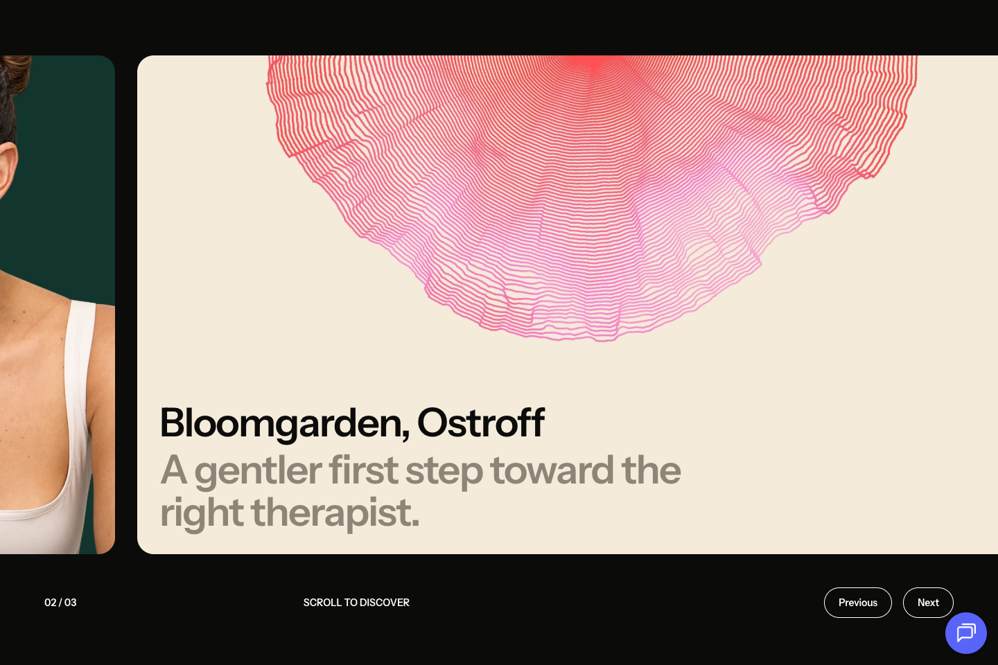
A visitor deciding whether to work with an agency needs more than a statement of capability. The selected-work sequence gives each project a substantial visual introduction, with the client name and a short description held inside the card.
On desktop, scrolling advances the sequence horizontally. The next project enters as the current one moves out, creating a deliberate change of scene. A counter and previous and next controls make the sequence understandable.
Touch browsing follows the same idea through a swipeable gallery. Visible controls keep each project within reach, while case-study pages give the work the space and context a card cannot.

07 / SOLUTIONS & INTERACTION
Make a broad offer easier to explore.
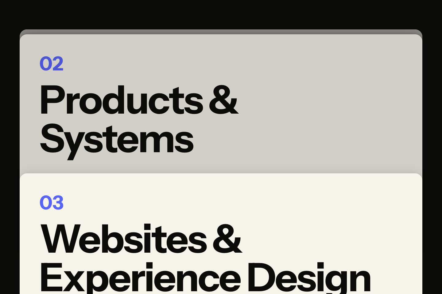
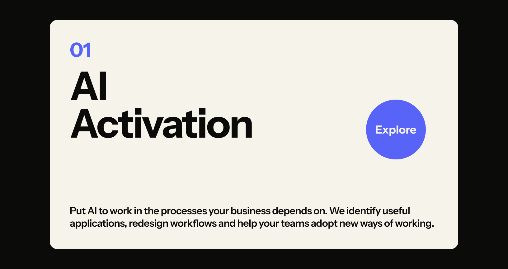
Superfactor works across connected business needs. The solution panels give that breadth an order: a large category title, a short explanation and a clear route into the detail. Earlier panels remain visible as depth behind the active one, giving the section a sense of progression.
A Sapphire Explore circle follows a pointer within the card as a quiet invitation. The category stays stable and readable while the affordance supplies movement. Touch visitors can open the card directly, and keyboard users receive a visible focus state.
The interaction adds character to a familiar action rather than creating a separate task to learn.
08 / IMAGE DIRECTION
Make the idea visible.
Our editorial imagery begins with the subject of the story. A connection, a gap, a passage or an arrangement of forms can make a business idea visible before a reader reaches the first paragraph.
A few substantial shapes, a clear focal point and generous space give the graphic collection its shared language. Cropping and scale create variety without turning every article into one repeated template.
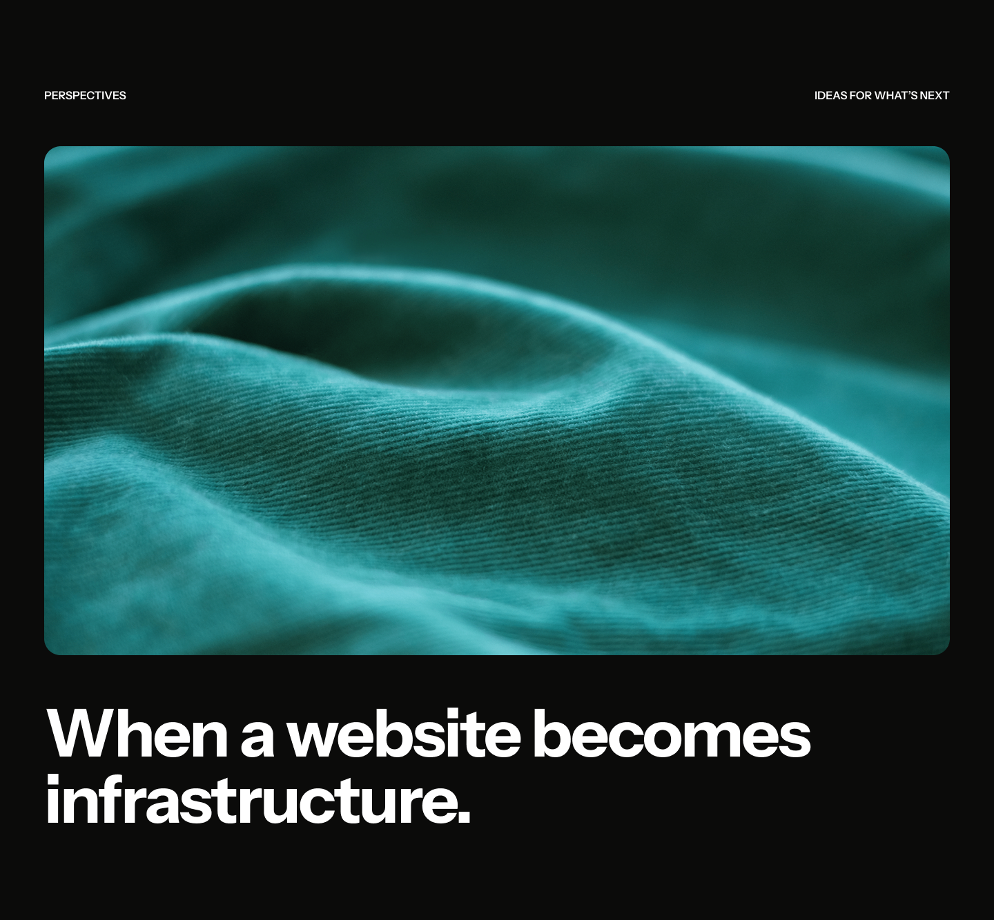
Close observations of material, texture and light bring a quieter register. Threads gathered into one surface make connection tangible; a fold in fabric gives the eye somewhere to pause. Images are selected for the idea they express, not as generic backdrops.



09 / PEOPLE & AGENTS
Human judgment sets the direction.
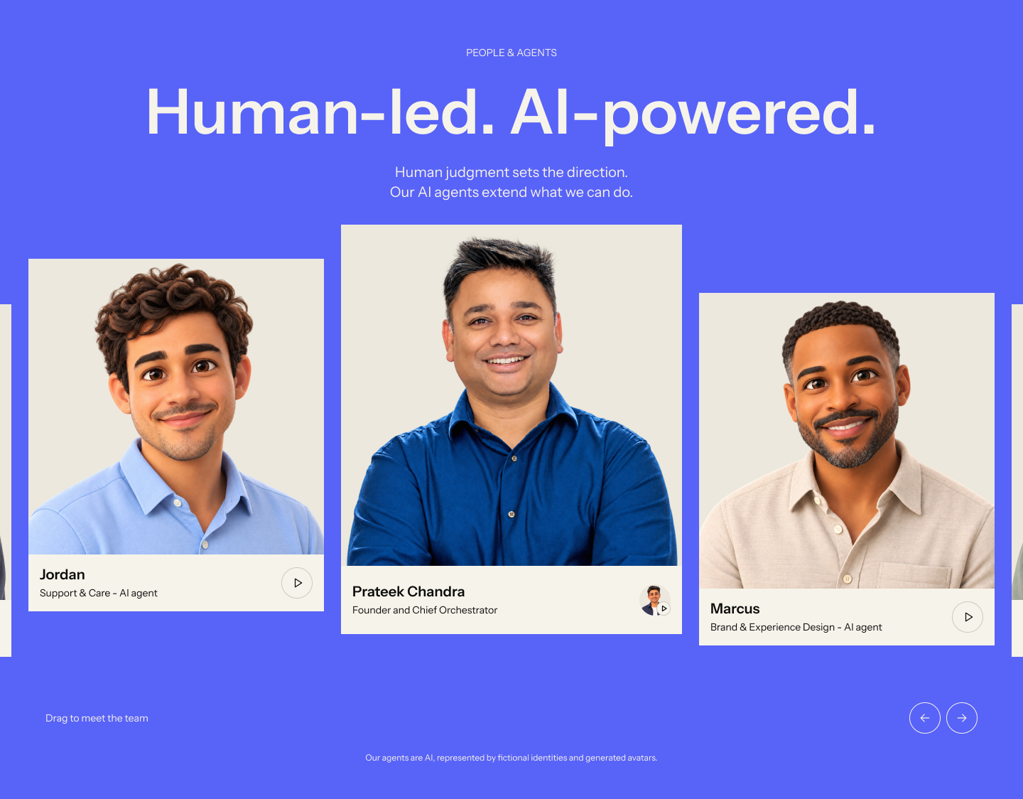
The founder sits at the centre of the desktop composition, surrounded by specialist AI agents. Different resting heights give the gallery a more personal rhythm than a uniform staff grid.
The hierarchy carries a clear distinction. Prateek is the human Founder & Chief Orchestrator. The agents extend what the team can do, with fictional identities and generated avatars identified as AI. Specific names and roles make the help each specialist offers easier to understand.
Shared framing and backgrounds connect the portraits; individual expressions keep them approachable. Video introductions give the characters a voice beyond the still image. The founder’s digital twin belongs to the same approach, with human direction explicit.






10 / OUR WAYS
Make the engagement easier to picture.
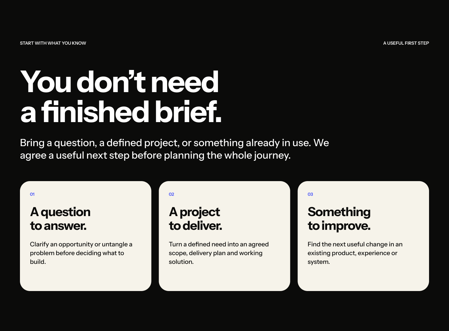
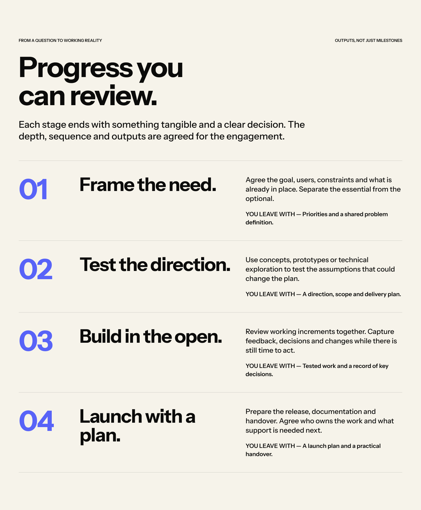
The website needs to explain how a relationship with Superfactor works as clearly as it explains what the agency can make. Our Ways separates ways to start from the stages of delivery, giving discovery, decisions, design, engineering and adoption a visible place in the story.
The delivery sequence pairs each stage with a practical description. A shared axis and consistent spacing create continuity, while distinct stages give the reader a place to pause.
It explains the decisions between milestones: where work begins, what needs to be agreed and how it moves towards use. The page supports a real project conversation rather than simply naming a methodology.
11 / CLEAR DESTINATIONS
Different questions deserve clear destinations.
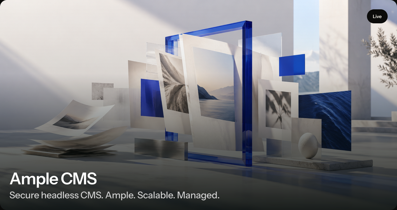
Work shows the evidence. Solutions explain the offer. Products introduce what we are building. About makes the agency and team visible. Our Ways explains the engagement, while Perspectives gives our thinking an editorial home.
The product catalogue gives our own products a place alongside client work. Each retains its own identity, purpose and audience within a shared card structure. Perspectives gives short updates and substantial arguments the same editorial care as the portfolio.
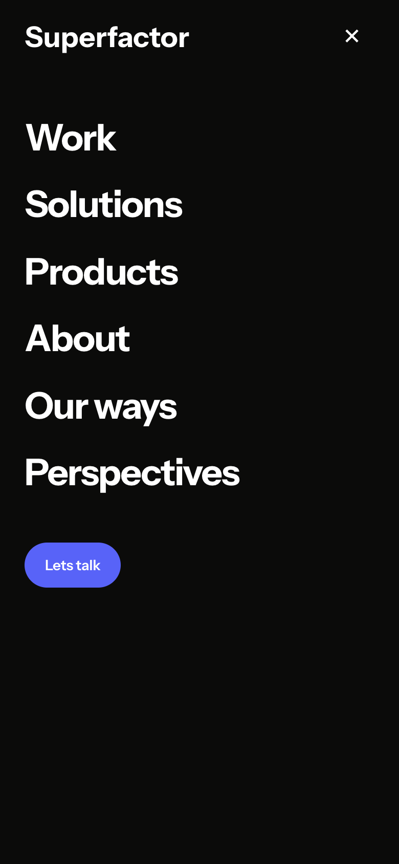
Those roles keep a broad website understandable. Concise navigation leaves the conversation action clear, and the same destinations become a direct vertical list on mobile.
12 / RESPONSIVE & CONSIDERED
The same character. A different composition.
A smaller screen changes the composition, not the identity. The slogan stacks more tightly, navigation becomes compact and galleries make room for direct touch browsing. The founder leads on mobile, while the agent cards remain large enough to understand.
Motion introduces the brand, reveals a message, guides reading and makes an available action easier to notice. Each movement belongs to something the visitor is already trying to understand or do.
A readable resting state matters too. Pause controls, keyboard navigation and reduced-motion treatments keep content available when animation is not useful. The invitation remains clear whether a visitor watches the entrance or goes directly to the information.


The outcome
What changed
A broader business.A coherent presence.
The work gives Superfactor a connected way to present what it does, how it works and who leads it. Identity, imagery and interaction share a common language, with enough range for a quiet explanation or an expressive brand moment.
A recognizable identity
FactorMark, FactorBar, colour and typography each have a clear role, from small signatures to larger communications.
A website that explains the agency
Work, solutions, products, people and perspectives answer different questions within one shared structure.
A system with room to grow
Reusable layouts, image direction, responsive rules and motion behaviours give future pages a coherent foundation.
FOUNDER PERSPECTIVE · DRAFT
“Our identity and website now reflect the agency we’ve become, bringing design, engineering and AI together in one clear experience.”

Prateek Chandra
Founder & Chief Orchestrator · Superfactor
MAKE YOUR
NEXT MOVE.
We help businesses build stronger brands, adopt AI, modernize systems, and create better digital experiences.
Wish to see how we can help?